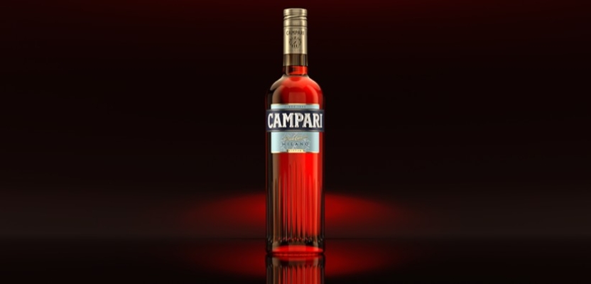

Robilant is a branding studio operating from the heart of Milan, capital city of Italian design. Last year, they worked on designing a new identity and packaging for Campari, paying homage to the brand's Milanese heritage, referencing the city's architecture with a grooved canneté bottle and a 'late Deco decorative theme'.
Robilant's Creative Director Fabio Molinaro believes that Campari always boasted a strong and memorable identity, but that can sometimes hinder change. Despite that, Campari was keen to move forward with passion and retain their strong position within the premium alcohol category.
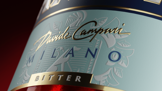
The new bottle design is meant to portray their meaningful connection to the city of Milan, but also making it look more premium and modern, with elegant touches of gold.
What was the brief for the rebrand?
The primary objective for this project was to elevate and enhance the already widely celebrated Campari bitter with a more premium brand image. A crucial aspect was to emphasize Campari’s connection to its place of origin - Milan - seeking to intercept the “genius loci” that drove the success of the brand and its product.
How did the initial pitch/brainstorming phase go?
When we began exploring the brand's profound legacy, we fully immersed ourselves and uncovered some wonderful hidden gems. We also sought to explore the experiential world revolving around the brand, finding its primary expression in the historic 'Camparino' venue in the center of Milan.
We identified three creative territories that encompass the brand's authoritative stance, self-confidence, and assertiveness, while also capturing its expressive attitude, intertwined with beauty and intrigue.
Describe the purpose of the brand and its target audience
Campari is unique and unmissable. Its vibrant and sophisticated iconicity and multi layered bitter taste are the quintessence of uniqueness.
What was your thinking behind the rebranding solution?
We sought to explore the relationship between Milan and Campari: understanding the nature of their connection, identifying commonalities between these two entities, and discerning the factors that allowed both to flourish throughout history.
In doing so, we identified shared traits upon which to build our project development: international allure, style, and elegance. Both entities have managed to stay true to themselves, leveraging their powerful history.
Did you learn anything new during the project?
Absolutely, we learned some wonderful anecdotes about Davide Campari's birth, life, and achievements. For example, did you know that Davide Campari was the first Milanese citizen to be born in Galleria Vittorio Emanuele?
What was the biggest challenge? How did you overcome it?
When you tackle this kind of historical and iconic brand, you want to be respectful yet still daring. And so, striking the right balance between preserving its heritage, and infusing innovative elements becomes crucial to remain relevant in contemporary markets.
What details are you most proud of and why?
We take immense pride in the new Campari, as our efforts on both the bottle shape and label have positioned the brand as the unequivocal focal point on bar shelves worldwide.
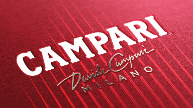
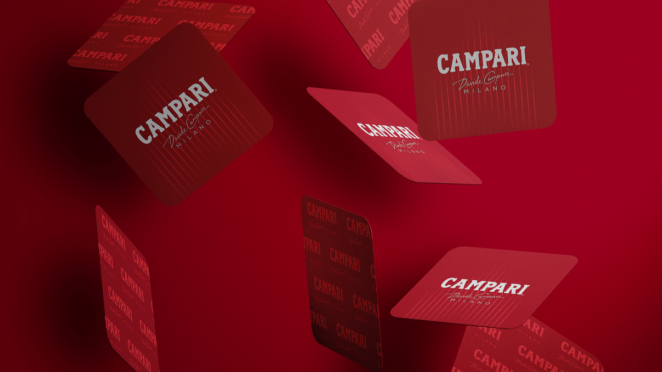
This new image continues to celebrate the iconic red hue of the brand, emphasizing the Campari Milano emblem and reinforcing the connection with founder Davide with his signature. Our satisfaction extends to the label's material richness and compositional depth, visible upon close examination and mirroring the concealed beauty found in Milan's courtyards.
The brand's new identity transcends the iconic bitter, seamlessly aligning with it through a Brand Visual Identity that captures the refined and cosmopolitan essence inherent to the brand, eloquently expressed in every aspect of its presence.
What visual influences fuelled your solution?
Influenced by the late Art Deco era, the use of “cannetè”, our design astutely references significant elements of Milanese architecture, highlighting Milan’s Galleria Vittorio Emanuele II in particular, a significant location in Campari's history, especially for the renowned Camparino.
What do you hope it achieves for the brand?
We are confident that our efforts will continue to propel Campari into a bright future, upholding the brand's enduring personality and values—passion, style, and contemporaneity. We hope this new fresh image we've crafted speaks to both longstanding and newer generations of consumers, fostering a timeless connection.
What would you do differently if you could do it over again?
The visual identity currently in the market was actually presented in the very first presentation.
The original concept has been preserved throughout the entire process. Honestly, I cannot imagine a more optimal approach.
Credit list for the work?
Fabio Molinaro, Roberto Decio, Diego Monti, Vincenzo Catoio